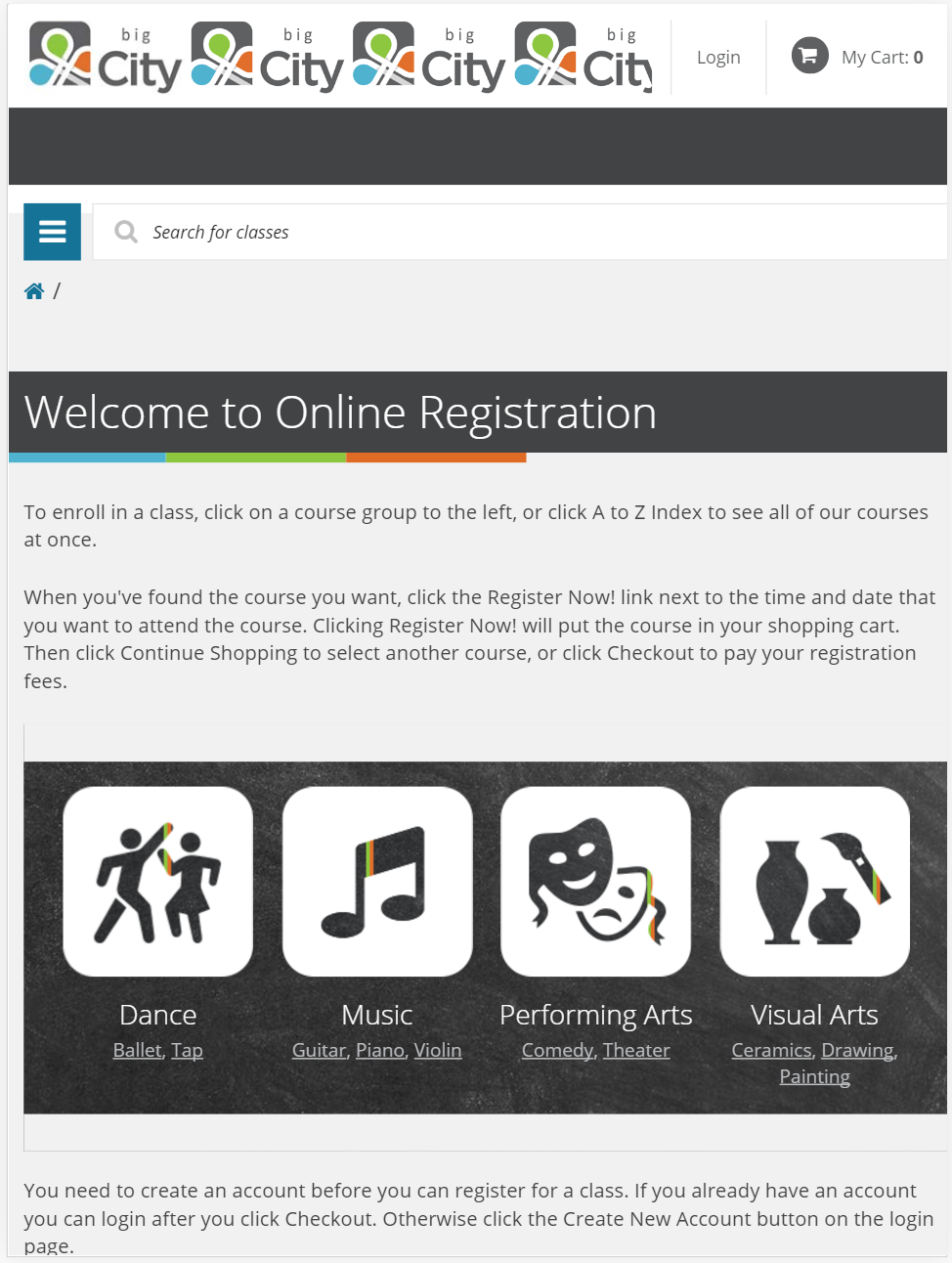
Mobile optimization is becoming more and more trendy these days and it is no surprise. Currently more than 50 percent of all global web traffic came through mobile devices and this number will continue to grow. We are happy to announce our new mobile responsive online registration site.
When a website is responsive, the layout and/or content responds or adapts based on the size of screen they are presented on.
A responsive website automatically changes to fit the device you’re reading it on.
Typically there have been four general screen sizes that responsive design has been aimed at: the widescreen desktop monitor, the smaller desktop (or laptop), the tablet and the mobile phone.
Imagine you’re viewing a website on a desktop PC. All of the text, images, videos and content are displayed with a certain orientation, resolution and proportions. Now imagine taking that same website and looking at it on the screen of your smartphone. As the screen size shrinks, a responsive website will automatically adjust to a changing orientation and resolution in order to maintain usability. Working behind the scenes to make this all work is a responsive design.
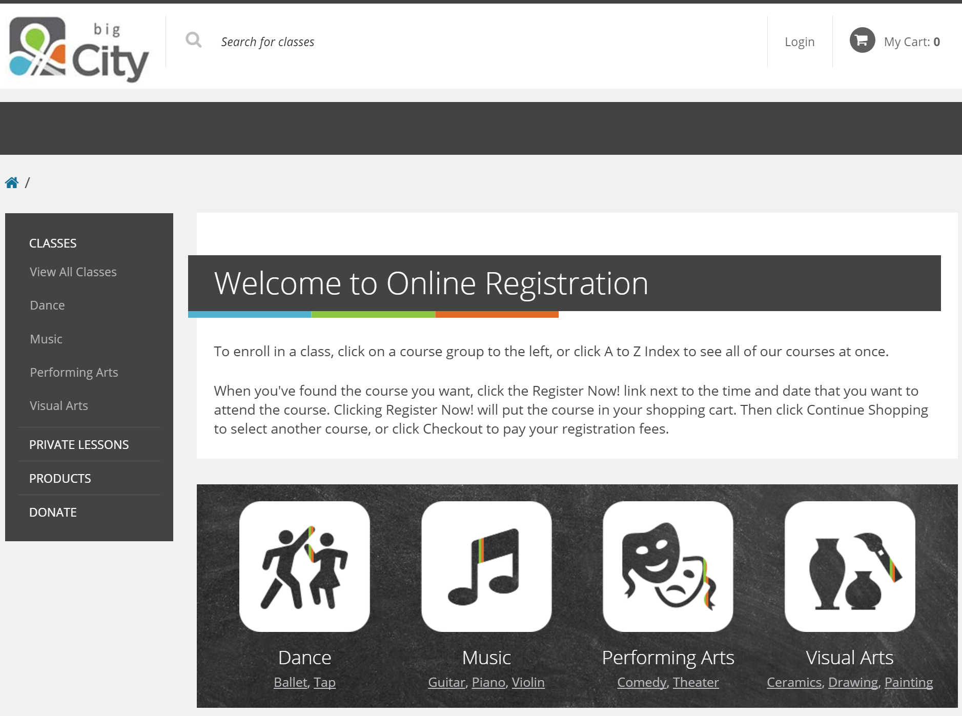

As we are still in the process of building the new online registration site, below are the features we fully support at the moment:
- Classes
- Private Lessons
- Donations
- Products
- Product Relationship
- Memberships
With the new site we also offer addtional customizations, for example site skin, custom domain, or even embed. Embed (or website widget) is a stand-alone application that can be embedded into third party sites.With this, you will have more control over customers' registration experience by embedding the ASAP application directly in your website, meaning your customers will be able to move through entire registration process without ever leaving your website.
If you are interested in site customizations or you have any question, please contact support or your client service manager for additional information.